UNCG Sustainability Rebrand
Client UNCG Sustainability Office
Year 2019
Objective To create identities, logos, and print materials that are on-brand with the University of North Carolina at Greensboro.

UNCG Sustainability Logo
The original logo did not meet brand standards as of 2019, i.e. fonts.
The new and improved options are on brand:


The new and improved logo for the Office of Sustainability is on-brand with University fonts and colors. The emphasis on earth conveyed in the "G" emphasizes "sustainability" and UNCG's commitment to a more sustainable campus and world.
The reversed logo as it would be seen on a darker background: "Sustainability" is in white while "UNCG" has a white outline.

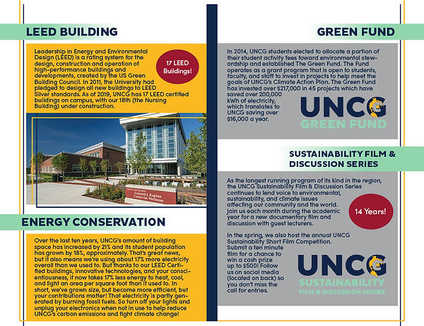
UNCG Sustainability Programs/Certifications
New identities were needed for the UNCG Green Fund and the Green Room and Green Room certifications.
STEP 1: Sustainability Marketing Meeting
I met with my supervisor (Art Director of UNCG University Communications), Mark Unrue, and Sustainability Specialist, Sean MacInnes, to discuss getting the UNCG Sustainability graphics on brand with the University brand guidelines. We discussed the Sustainability logo, the recycling guide, graphics for different Office of Sustainability certifications, and other upcoming projects regarding the Office of Sustainability's brand. I took notes during this meeting to keep track of to-dos and ideas that Sean initially had, as well as those that Mark and I offered.
STEP 2: Designing the new identities and the Bigbelly kiosk
As part of my brainstorming process, I typically design as many options as possible. In this way, neither the client nor I are constrained by limited options. After receiving these options, the client can either choose a final design from these options, critique an option they really like or consult with me about creating a new one that combines the options already presented. For most of this project, I sent my ideas to Mark for review first, followed by Sean for review. Sean was very direct and knowledgeable about his vision, which is not always the case when working with clients. On this project, he also consulted the Sustainability Council about the design decisions that were made; it was a pleasure working with him.
UNCG Sustainability Logo
The original logo did not meet brand standards as of 2019, i.e. fonts.
The new and improved options are on brand:


The new and improved logo for the Office of Sustainability is on-brand with University fonts and colors. The emphasis on earth conveyed in the "G" emphasizes "sustainability" and UNCG's commitment to a more sustainable campus and world.
The reversed logo, as it would be seen on a darker background: "Sustainability" is in white while "UNCG" has a white outline.
The new UNCG Sustainability logo as seen on the Sustainable LIving Guide
UNCG Sustainability Programs/Certifications
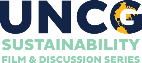
New identities were needed for the Sustainability Film & Discussion Series,
the UNCG Green Fund, and the Green Room and Green Room certifications.
The identities for the programs and certifications follow the same style as the UNCG Sustainability wordmark.
The Sustainability Film & Discussion Series
The Green Fund

Previous

Updated
The Green Office and Green Room Certifications
.png)


The Clover Infographic
UNCG defines sustainability as the enduring interconnectedness of social equity, the environment, the economy, and aesthetics. A four-leaf clover was chosen because of the four themes highlighted in that definition. Including aesthetics in their definition of sustainability makes UNCG Sustainability somewhat unique compared to other institutions, which typically only focus on three themes, thus the uniqueness of the 4-leaf clover. The objectives were to recreate/update the graphic from the Campus Master Plan, move away from a literal representation, promote the interconnection of the themes, and convey some of the subsystems (for lack of a better term) within each one.
-- UNCG Sustainable Living Guide and Sean MacInnes

*Pictured above is the original design concept which is clover with symbols that I thought represented each theme. I also tried to align the symbols and themes with UNCG brand colors (pictured on the second row).

The infographic from the Campus Master Plan
After discussing my first concept and the graphic from the Campus Master Plan, Sean offered ideas for icons that could either go in the logo or be used as a guide to design the new infographic.
The new infographic combines my first concept and the graphic above. It maintains the shape of the CMP graphic— "abstract clover," as I like to call it—while employing the more literal clover and icons based on the list Sean provided. It adheres to brand colors and includes one of the UNCG fonts. The number of icons is consistent for each themed "leaf" section.
.png)
Bigbelly @ UNCG
Bigbelly is the world leader in smart waste & recycling solutions for public spaces. It is a proven solution that is deployed in all 50 states and in over 50 countries around the world.
- Bigbelly
My responsibility for the Bigbelly portion of this project was to design the Bigbelly kiosk using the new identities, brand colors, other graphics provided, and a picture of a building on campus (Foust) according to the speculations that were provided to me.
After the specs for the kiosks were confirmed by Sean and Mike Phillips, Regional Account Manager for Bigbelly, I was good to go on designing each panel for the Bigbelly kiosk.
Illustrator would not allow me to create a 2-inch bleed around the artboard, so I made the artboard wider to accommodate that. The white or black square on the inside marks the specs required. The grey boxes indicate the flap or faceplate, the hopper, the locks, and the optional foot pedal.
_2015Jun.jpg)
_2017Jun_01.jpg)
_2017Jun_02.jpg)
_2017Jun_03.jpg)
_2017Jun_04.jpg)

Initially, I created four designs for the Bigbelly wraps. Then I made more versions of the 3rd and 4th designs. There was plenty of consulting between the Design Team and Sean while creating a final version that developed from the 3rd Bigbelly wrap design I created. Many changes occurred to the wraps, i.e., creating a reversed version of the Clover infographic for the navy background, changing the picture, adjusting the sky, adding the Sustainability logo, adding the QR code, etc. Finally, the Clover infographic was omitted to create room for an insert on either side of the Bigbelly wrap. The Recycling Guide would go on one side while another insert would be on the other. See some of this process below.
Above is one of the original versions that include the grey boxes as well as the clover infographic.
This version shows the panels before the change was made to omit the Clover infographic and for the kiosks to have an insert on both sides. It does not include boxes. I cannot remember why exactly, but I believe it was suggested by Bigbelly's design partner, FASTSIGNS, who created the final mockups that show the kiosks as they would be seen on campus (BB5 - DUO: UNC Greensboro - 01). Changes: The UNCG Office of Sustainability unit logo was replaced with www. sustainability.uncg.edu, and the picture was zoomed out.
The final version also does not include boxes. Changes: The Clover infographic was committed and the website is moved down to match the placement of the UNCG Green Fund logo.

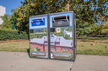
Bigbelly on the UNCG Campus. Photo by Martin Kane
STEP 3: The Sustainable Living Guide
This project was exciting and very informative. I learned about having creative autonomy while working with others to complete a common goal. At first, I did not know what the Sustainable Living Guide would look like. The only thing I knew about the "look" was the dimensions: 11x8.5 inches finished to 5.5x8.5 inches. The first step in this process consisted of discussing the dimensions, the status of the body copy, and the pictures that would go into the booklet. In addition, I began a layout design for the guide. The front and back covers were designed first. The layout for the rest of the pages came next.
I referenced previous UNCG magazines and the Sustainable Living Guide from Christian Brothers University provided by Sean for inspiration. I also reflected on some of my experience with brochures/booklets to design a simple, clean, and UNCG-branded piece. The layout was sent and approved by Mark and Sean. Once the photos were chosen by Sean and edited by me, and the body copy was ready, I decided to add to the layout and apply changes as I inserted those materials into the brochure for more cohesiveness. During this process, changes to some of the body copy sections were made to make them more concise, as well as changes to the layout to accommodate those changes.
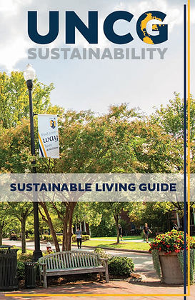
UNCG Sustainable Living Guide
_v3.jpg)
(Left to right) Back cover and front cover.
_v3_022.jpg)
_v3_023.jpg)
_v3_01.jpg)
_v3_025.jpg)
_v3_026.jpg)
View the Sustainable Living Guide online here!
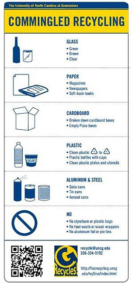
STEP 3: The Recycling Guide
This project was exciting and very informative, as well. I also learned a lot about having creative autonomy while still working with others to complete a common goal with this project. Sean shared a few examples with us, and I also looked online. The first step in this process required discussing the dimensions, any references Sean shared, and UNCG's guidelines for recycling glass. Those guidelines were potentially in contrast to the City of Greensboro's guidelines for recycling glass. At first, the Recycling Guide had been put on the "back burner" for that reason. When it was time, I began a layout design for the guide. I came up with ten different possibilities before working on the icons.
While looking at the various Recycling Guides that Sean sent me, I decided it would be cool to have a mixture of 3D and 2D icons. With the help of YouTube tutorials, and some Adobe tutorials, I learned how to create 3D materials in Illustrator. It was a long process, especially when adding symbols to icons, i.e., the battery. Another challenge I had was working on the texture of the plastic bag. Overall, I felt very accomplished with and enlightened by the finished product. This project was my favorite because I learned something completely novel and created it for the finest university in the world. See the previous Recycling Guide, the updated version, and some close-ups below.
UNCG Recycling Guide


Ariel pictured with Bigbelly featuring the Recycling Guide. Photo by Ivan Richardson.

View the Recycling Guide online here!